Who is responsible for this installation? It’s presented as Wes Larsen’s work, but I don’t see an ounce of any artist’s or designer’s personality in it. This duality-themed piece is default to the ’t’ that ends the word default—dull not as a result of working but as a consequence from how one works.
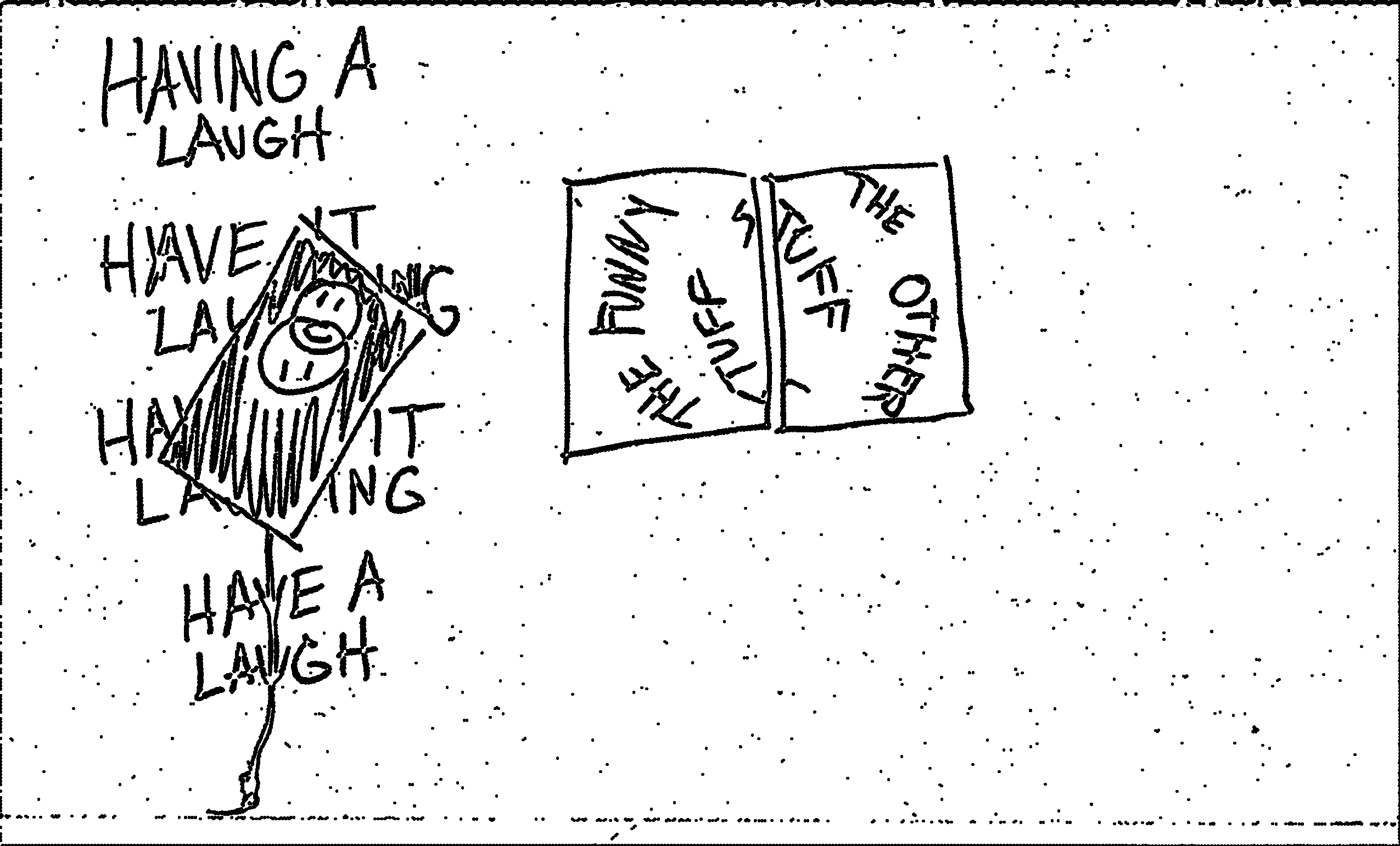
There is one thread that weaves itself through this installation and that is duality. There are the obvious smiley face and typographic Venn diagrams in the painted panels which are meant to depict dueling simplistic forces and their intersection, but other instances of duality can be seen in the materiality of the pieces that compose the installation: both Venn diagram pieces are painted with glossy paint on dull surfaces; the black panel rotates while the white panels are fixed; the wall vinyl text is cleanly cut while the text on the white panels has a blowout (peppering) edge where the letters were masked for painting; the tops of the panels are painted while the edges are exposed wood; the list goes on and on. But even on a conceptual plane, particularly in regard to the language, the typographic phrases in the installation bounce between two hemispheres: demands and happenings, with negative and positive connotations respectively. “Have it laughing” and “Have a laugh” are demands; “Having a laugh” and “Having it laugh” are happenings. This idea of demands and happenings then translates to the white panels’ “The funny stuff/The other stuff” Venn diagram: happenings of laughter are the funny stuff, the positive; demands for laughter are the other stuff, the negative. All of this together is a duality of work versus play.
But the work and play of what? And again, by who? Successful minimalism is the result of a design process, not something a designer decides to do from the outset. The overt default-ness of Larsen’s installation indicates that it was driven by this misconception and therefore conveys a sensibility that he couldn’t be bothered to risk aestheticizing his own work. Like a graphic design graduate’s portfolio website from the early 2010s, the designer is so concerned with the judgement they may receive by the public or how they have (or, more likely, haven’t) captured the subtleties of life that they conceal themselves and their work from such exposure—but they’ll tease us with a rotating too-cute-for-school gif. Can’t be bothered to risk associations with color: only use black and white. Can’t be bothered to tout a style: only use generic uninflected serif and sans-serif fonts. Can’t be bothered to navigate the nuance of layout: center-align the text with a rotating canvas centered on it, and then hang the other two panels at typical gallery viewing height. Can’t be bothered to risk having the viewer think too long about a concept: only use a basic two-circle Venn diagram. This is textbook default design.
It’s so default that the one thing that should trigger my vertigo-laden inner ear—the rotating black panel—is so slow, safe, and silent that I don’t ever fear being on edge. Even the “racial harmony” of the black and white cookie couldn’t prevent Jerry from breaking his 14 year no-puking streak in an episode of Seinfeld (“I think I got David Duke and Farrakhan down there [in my stomach].”), so what makes Larsen believe that default conditions are going to proclaim some sort of phenomenological condition? In no way am I arguing against minimal or slow durational works. Brian Eno’s music and installations are perfect examples of minimal phenomenological conditions needing an extended period of time in order to be fully grasped. Hell, I could share with you some one-note-held-on-an-organ-for-20-minutes songs that would bore you to death, yet to me they induce the faint feeling of something unnoticed crawling, hiding, preying out in the ether. And it’s that anticipation of a random everyday happening mixed with generative—the opposite of default—conditions that make Eno and other ambient artists’ works unexpected experiences with each listen or viewing. Larsen’s installation, however, is what it is. Full stop. It’s a facade of invulnerability which stems from the fact that default design systems are deliberately invisible, and, in the words of designer Rob Giampietro in an interview with Emigre,
this kind of work self-consciously positions design as stupid and trivial and says that documents of importance needn’t rely on design to shape them. Default Systems are machines for design creation, and they represent design publicly as an “automatic” art form [...] Default Systems are a number of trends present in current graphic design that exploit computer presets in an industry-wide fashion. They are a quasi-simplistic rule-set, often cribbing elements from the International Style in a kind of glossy pastiche, a cult of sameness driven by the laziness and comfort of [...] the Macintosh.1
In the same interview, Giampietro oddly goes on to shit on 90s Cranbrook design and how it’s “fussiness for its own sake” design sensibilities were “brash and dogmatic,” and that Cranbrook’s models, “like those of designers using Default Systems, were found in ‘low’ forms, and the ceaseless glorification of these forms was as self-indulgent then as it is now.” However, the design studio Metahaven uses default (internet) aesthetics mixed with 90s Cranbrook’s “fussiness for its own sake” in a majority of their work, but the difference between their work and Larsen’s (and Giampietro’s argument), and the reason it resonates with so many people, is that it recognizes that design, in their own words, is nothing but “added value.” Metahaven argues that “design only generates longing,” and that the problem-solving designers love to label their practices as is a “problem of luxury.” So where Giampietro’s argument against Cranbrook’s sensibilities crumbles is that default conditions aren’t “low forms”—they stem from luxury design’s obsession with sleekness and that it is next to cleanliness and cleanliness is next to godliness. Not all sleekness is unethical, but when it manifests as luxury—lacking a need for cognition—it becomes inhuman and inhumane, just like the dual manner of Larsen’s demanding but also faux-serendipitous laughing installation text—it’s a joke not with a punchline but a punch to the gut that demands you be in on the joke in order to be in on what’s “cool.” Default sleekness only makes an audience feel bad for their arcane interests, even if that means making a designer feel bad for liking anything with a little creative flair. It’s a fascist attempt at homogenization, or as musician Ian Svenonius argues:
The hit A&E TV show Hoarders identifies people with things as socially malignant, grotesque, primitive, dirty, bizarre. In a word: poor. Apple has turned the world upside down in making possessions a symbol of poverty and having nothing a signifier of wealth and power. [...] The shaming of targeted “hoarders” is intended specifically to cajole, bully, and embarrass the population into giving up everything they have; not just possessions but ideas, ethics, rights to ownership (both intellectual and otherwise), privacy, decency, justice, fair treatment, and human rights. In the Apple-internet age we are expected to surrender absolutely everything; anything less is filthy and deranged “hoarding.”2
Even the attempts by Larsen to dirty-up his installation are default sleek, in particular the mud/clay-like texture coated neatly over the wooden panels so that the Venn diagrams can be painted as neatly as possible on top. Again, this installation’s duality of an intimidating idea oppressed by an overbearing carefulness in its presentation conveys Larsen as overcomplicating or being in conflict with the banality of human nature. To then lean on default conditions—a system lacking cognition that then tries to dismantle human nature with such thoughtlessness—only traps this work in the lie that default system designers tell themselves in their lazy, automated, and machine-like state of mind: that the lack of hierarchy, typographic intervention, and “fussiness” leads to a more inclusive and active state. False. We need to be who we are naturally in order to have fun, which artist David Robbins describes in his book Concrete Comedy:
Without the actual, without Things As They Are, comedy has nothing to make fun of, and nothing to make fun from. [...] without the actual comedy has no material. What we call “comedy” is an everlasting ping-pong match between two undefeated world champs. Contestant first is The Actual—any existing thing, concept or feeling known to us in this world. Contestant second is What We Say About Or Do To The Actual. The game played between them has no end. No score is kept. Tickets are free. Attendance is mandatory.
Again, minimalism can be perfectly natural, but it relies on being here, being present, and letting life’s trivialities swirl around you and attach to your work. It’s inhuman for a person to not want to positionally offset something to their liking. It’s inhuman for a person to not want some dumbness to go with their thoughtfulness. It’s inhuman for a person to laugh at nothingness. As Giampietro states, “In most contexts, ‘to default’ is to fail. To be ‘in default’ on a loan is not to pay it; to ‘default’ in court is not to appear; to win ‘by default’ is to win because the other team did not play.” This installation proves that all work and no play makes Wes Larsen a dull boy.